Without scroll-stopping images, even the best, most valuable content can get lost in the feed. Depending on the type of image, a good scroll-stopper can increase reach, engagement, and website traffic. Let’s break down the value of a great image:
LinkedIn posts with images have a 98% higher comment rate, on average.
Tweets that include visual content are three times more likely to get engagement.
This post will show you how to increase reach, and engagement by using images that each social media algorithm wants. There are many types of images you can share on social media ranging from branded images with a beautiful background and text, to photography. Keep reading for a breakdown of the different image types and how you can best use them on each social media platform.
Branded Image Templates
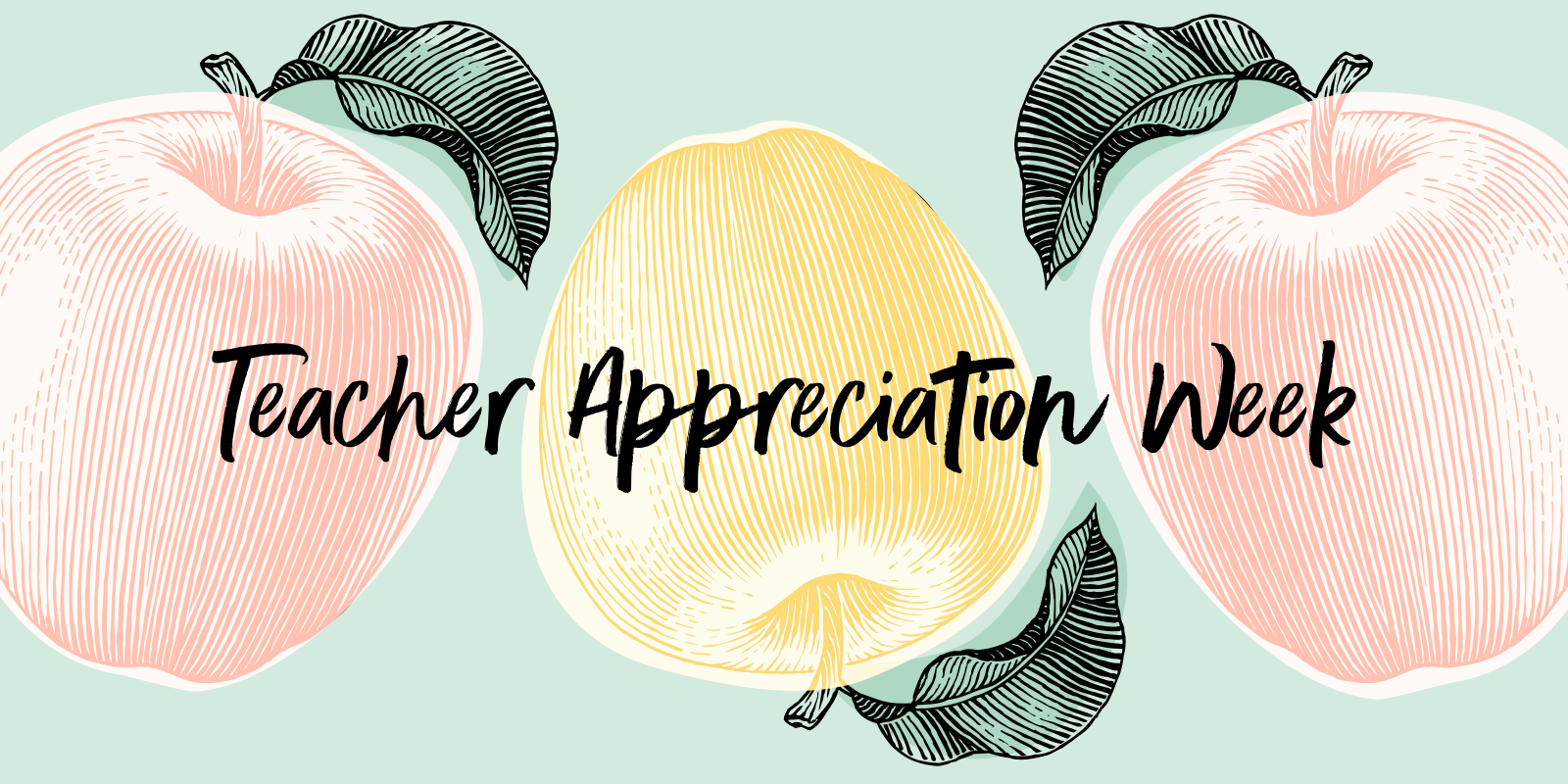
For starters, you can increase reach with branded graphics. Images without a person (think branded graphics) get shared 124% more than images that include people. We recommend creating image templates using Canva. Consider creating a series using quotes, interesting facts, or helpful tips related to your brand that will resonate with your target audience.
There are a few key factors to keep in mind when designing branded graphics and templates for social media:
Keep the order of operations in mind. You can use copy in the post to expand on the image, but people will look at your image first, then the copy you write above.
Keep the text on the image concise, straightforward, and easy to read. Less is more when it comes to text images on social media.
Other text rules (consider adding these to your brand style guide!):
Titles: Capitalize the first letter of each word. This makes the title stand out and easy to read.
Dates: If writing out the date, write out as December 8 or Dec. 8 not December 8th - this keeps it concise. You can also use numbers: 12/8
Times: Consider what time zone the event you are posting about is in. If it’s a national event, always include PT and ET. Example: 11am PT | 2pm ET
Avoid orphan words. It can throw the entire image off to have one word dangling on the end of the image on its own line. Readjust line spacing or text size to correct this.
Avoid long paragraphs. If your text extends past 4 consecutive lines, consider turning it into a gif. Nothing makes someone scroll on by like a lot of text that looks hard to read.
Use sentences with 8 words or less as they are easiest to comprehend. Consider this when writing text for social media images.
Save the minor details for the copy or a proactive comment rather than cluttering your image with more text.
Accessibility is crucial for all social media images and it’s easy to add in pretty much any social media scheduling tool and on every social media platform. There’s no excuse to exclude alternate text. #AccessibilityMatters. Our blog post features 5 great points to consider to make your images accessible. A few things to keep in mind when writing alternate text:
Alt-text is first and foremost, designed for accessibility, so describe the image and give context.
Include keywords without keyword stuffing
Keep it short (125 characters or less if you can)
#CamelCase your hashtags so it’s easier to read visually and for screen readers.
Images to Promote an Event
Promote your upcoming brand events with an image. Make sure you think mobile first and only include the most critical pieces of information. The rest of the information can be saved for the copy or a proactive comment. Keep in mind a link to the event details can also be shared with the image.
Do include:
Event Title: Make sure this clearly explains what the event is
Event Date and Time (remember to include multiple time zones, if applicable)
Event Location (if applicable)
How to RSVP (if needed)
Optional: Photo, name, title of keynote speaker or person leading the event if the person is someone who will drive traffic to the event. If it’s someone that your audience won’t recognize, it’s probably not worth including in the image.
Don’t include:
Key takeaways: This can be highlighted in the copy or included in the event registration link
Long description of the event. They should be able to get an idea from reading the title what the event is and if they are interested in learning more, they can click on the event web page.
Bios of the speakers. Save these details for the website.
Avoid highlighting that a recording will be available later. This could decrease your live attendance for virtual events. You can share this detail or clips of the recording after the event.
Photography
Did you know images with people generate 109% more comments than images without people? Get creative with how you can highlight photos of humans in your programming. A few ideas go get you started: Images of your team members, images of students from a recent case study you shared, and teachers in action using your product if you’re an EdTech brand.
A few things to keep in mind when sharing photos on social:
Be face forward.
Show human elements. Images with body parts earn 29% more likes than an image with a person. (Example: Show your product with hands holding it.)
LinkedIn is a great place to highlight the people behind your brand, achievements, and opportunities. By adding an image to your LinkedIn post, it is 12X more likely to get engagement when it includes an image.
Curated Images
Add value to your audience with curated images. These images are created by someone else, hence “curate.” Think memes, powerful quotes, and infographics. These are meant to be fun and engaging, so they are typically not as “on brand” as your branded images. A few things to consider when sourcing curated images:
They should align with the topics you talk about and/or will resonate with your audience.
The source should always be cited on the image and in the copy.
If a source is unknown, consider re-creating the image or make note of the unknown source in the copy.
The quality of the image should still be good (not too pixilated, no weird branding from someone else).
Even though this isn’t your image, you should still be proud of everything you share on social. Make sure it meets your general standards.
Facebook Text Images
Facebook has a text + image feature that the algorithm and followers love. It offers a variety of background options to use that can be typed on. These posts generate the highest reach and engagement on all of our clients accounts. Users are used-to and recognize these post types on Facebook and the intent is that they are specific to the platform, and not necessarily specific to your brand.
You can choose the background types you feel align with your brand the most.
We recommend picking the background that flows with the topic of the text.
Social Media Image Size
Last, but certainly not least, keep your images channel-specific. It is important to size images for each platform, or they could end up cut off, stretched, or hard to read. Follow these size guidelines to keep images professional and platform-specific:
Including different types of images in your programming should be a no-brainer. Images can help grow your brand presence, increase reach, and get your audience engaged. Save time by creating branded image templates sized to each platform, and remind your team to take pictures during those social-media-worthy moments at events and even behind the scenes. If you want to take a deeper dive into crafting social images, I linked a few of my favorite resources below.
Resources


